Branding
How to Choose Brand Colors for Social Media and Ads
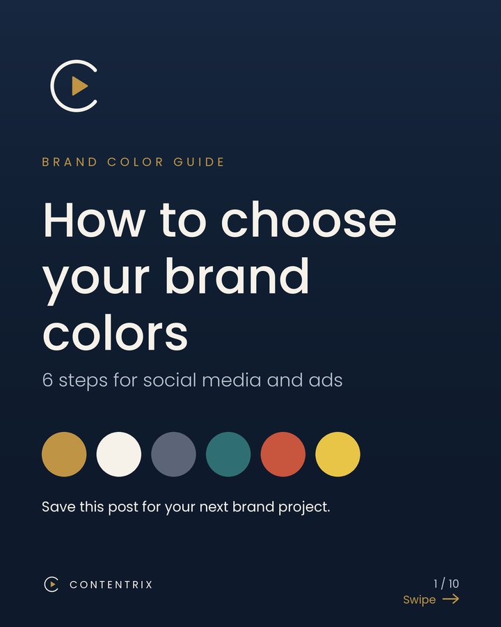
Color is often the first thing people notice about a brand, before they read a word. A clear palette makes your posts, Reels, covers and ads look like they belong together, and it saves you time because you stop guessing every time you design. This guide gives you six steps to choose your brand colors, with a focus on social media and advertising.
1. Start with three words that describe your brand
Before you open a color picker, write down three words for how you want people to feel: for example calm, bold and premium, or friendly, playful and fresh. Then choose colors that support those words. These are common associations, not rules:
- Blue: trust, calm
- Red: energy, urgency
- Green: growth, health
- Yellow: optimism, warmth
- Black or dark navy: premium, serious
- Purple: creative, imaginative
Color associations change between cultures and industries, so test your choice with a few real people in your market before you commit.
2. Look at your competitors
Collect five brands in your field and write down their main colors. If all five use the same blue, you will blend in if you use it too. You do not need to be different in every way. Choosing one color or color combination that your competitors do not own is often enough to be recognizable in a crowded feed.
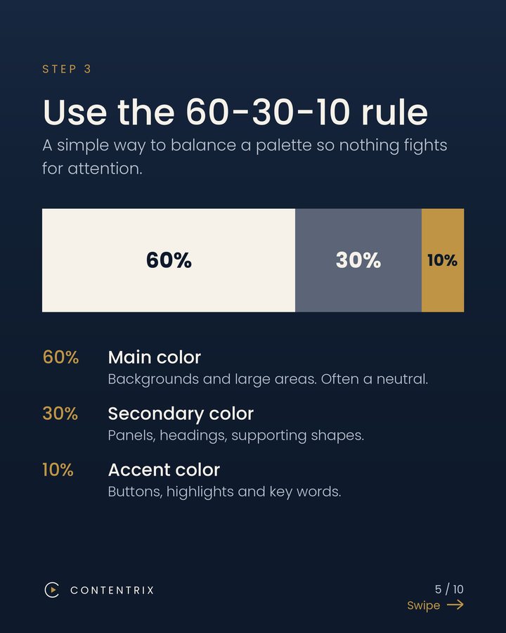
3. Use the 60-30-10 rule
A simple way to keep a palette balanced is to divide it into three roles:
- 60% main color: backgrounds and large areas, often a neutral.
- 30% secondary color: panels, headings and supporting shapes.
- 10% accent color: buttons, highlights and key words.
The accent is small on purpose. Because it appears rarely, it draws the eye to the things that matter most.
4. Pick a palette type
Most good palettes follow one of three simple structures:
- Monochrome: shades of one color. Calm, elegant and hard to get wrong.
- Analogous: colors that sit next to each other on the color wheel. Soft and harmonious.
- Complementary: colors opposite each other on the wheel, such as blue and orange. Bold and high in contrast.
Keep the total small. Three to four colors, plus black and white if you need them, is enough for most small brands.
5. Check the contrast
Text has to be easy to read on every background you use, especially on a phone screen. The Web Content Accessibility Guidelines (WCAG) recommend a contrast ratio of at least 4.5 to 1 for normal text and 3 to 1 for large text. Free tools such as the WebAIM Contrast Checker let you paste two HEX codes and see whether the pair passes. Light gold on cream, for example, looks elegant in a mood board but fails as body text.
6. Make it work in your ads
Ads add a few extra rules to your palette:
- Use one accent color only for the call to action. If the button is the only gold element, the eye goes straight to it.
- Keep the same colors across every ad in a campaign. Repetition builds recognition faster than variety.
- Save your exact HEX codes. Write them in one shared note so every designer and every tool uses the same values.
- Test on both light and dark backgrounds, because your ad will appear in feeds with both.
An example: the Contentrix palette
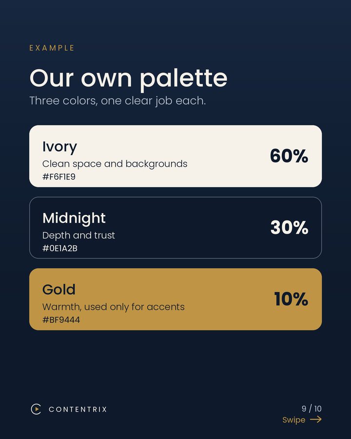
We use three colors, each with one job. Ivory (#F6F1E9) is about 60% of what you see and gives clean space. Midnight (#0E1A2B) is about 30% and adds depth and trust. Gold (#BF9444) is about 10% and is used only for accents such as buttons and highlights.
A short checklist
- I can describe my brand in three words.
- My main color is different from most of my competitors.
- My palette has a main, a secondary and an accent color.
- My text passes a contrast check on every background.
- My ads use one accent color for the call to action.
- My HEX codes are saved in one place.
Choosing colors is one of the first steps in building a brand people recognize. Once your palette is set, everything else you make, from Reels to covers to ads, gets easier to design and easier to recognize.